Color Drenching: How One Color Can Transform a Room
Color drenching is having a moment in interior design—and honestly, it deserves the hype. By going all in on a single color across an entire space, it creates rooms that feel bold, cozy, and intentionally pulled together (no wishy-washy accents required).
If you’ve ever wondered what color drenching actually is, how it works, or whether it’s right for your home, you’re in the right place.
What Is Color Drenching?
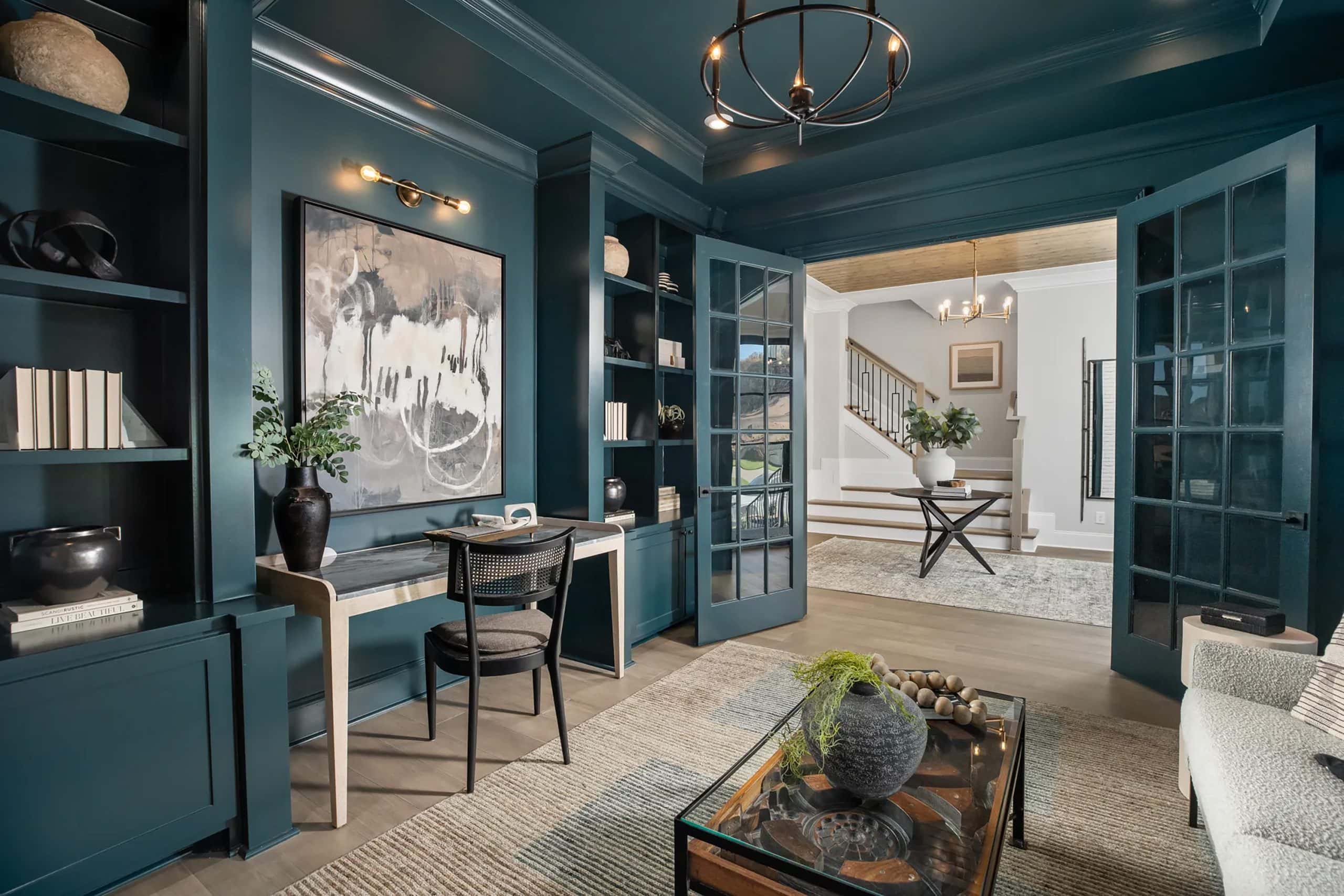
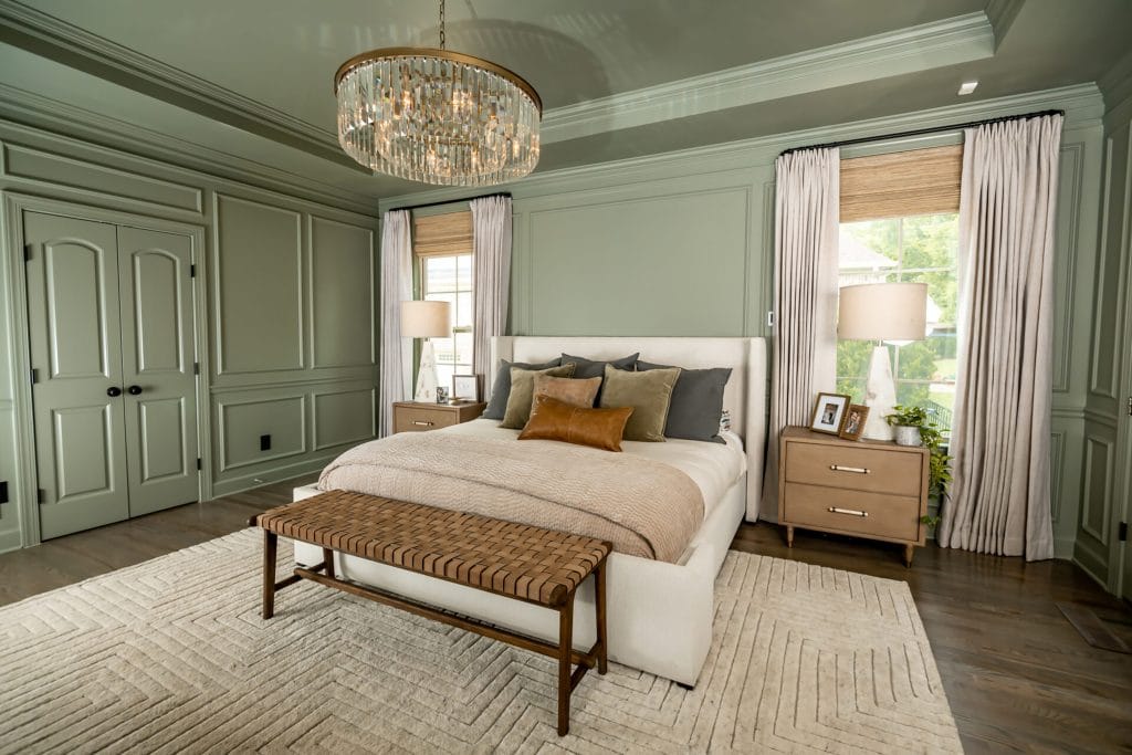
Color drenching is a design technique where a single color is used across every surface in a room. Color drenching is bold and immersive. Everything is painted the same shade (while some variations in sheen can be used), wrapping the room in color from top to bottom. The result is high impact and full commitment—no visual interruptions. (Learn the best way to use this technique in your home!)
This includes:
- Walls
- Ceilings
- Trim and baseboards
- Doors and molding
- Sometimes even furniture or architectural features
Unlike traditional decorating—where ceilings and trim usually play it safe in white—color drenching lets color be the star of the show, wrapping every surface in the same hue for a look that feels cohesive, confident, and just a little bit dramatic.
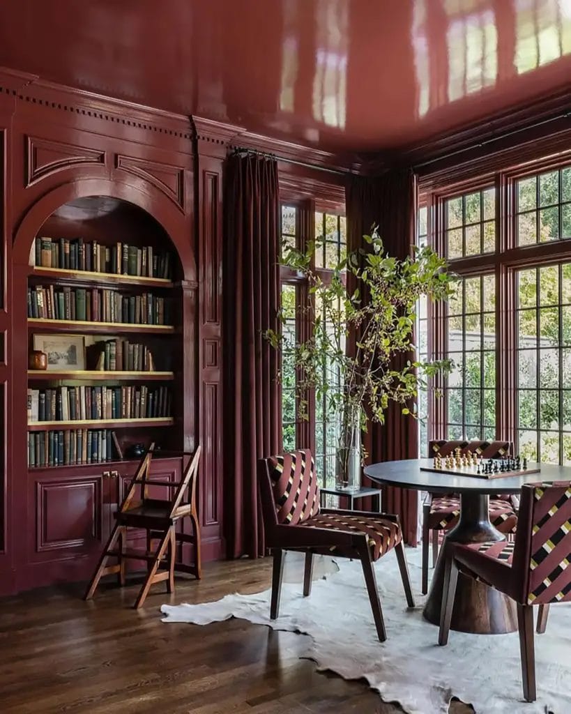
Color Drenching vs. Monochromatic Design
Color drenching & monochromatic techniques easily get mistaken for each other. While the two are similar to a point, they create very different results. Knowing the difference makes it easier to choose the right mood, scale, and level of drama for your space. (Want to learn more? Book a consultation!)
Monochromatic Design
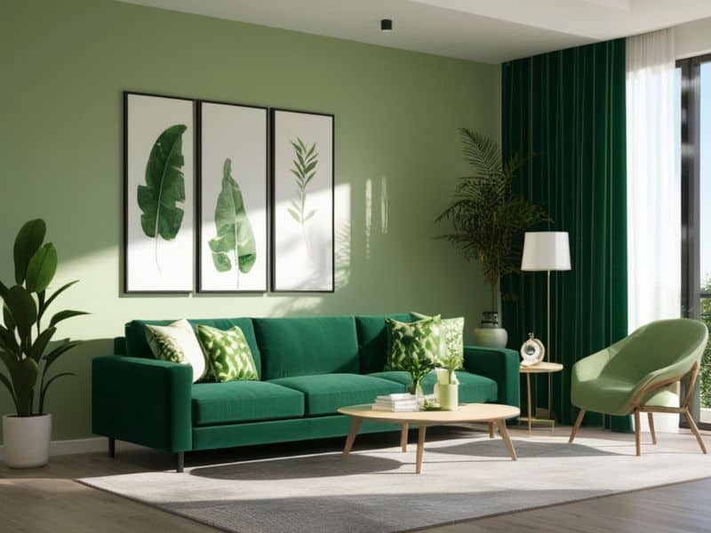
Monochromatic spaces use variations of one color—lighter, darker, softer—to create a layered, subtle look. It’s calm, controlled, and quietly stylish. Using varying hues of a color family allows details and textures to stand out while creating subtle nuances throughout the space.
Color Drenching
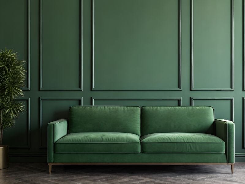
On the other hand, Color Drenching takes a confident, all-in, single color approach. It’s bold and immersive, with walls, trim, and ceilings painted the same shade— so the room feels enveloped in color. The payoff is a high-impact, continuous visual experience . It’s a powerful way to add drama or transform smaller spaces into striking, cohesive environments that feel thoughtfully designed and truly memorable.
Why Color Drenching Works So Well
This color application isn’t just dramatic—it’s smart design. It’s your opportunity to conquer that awkward space or create an interesting, moody effect. With the right color selection, it can also make a small room feel airy & cohesive.
Color Drench with Light or Mid Tones: Instant Space Magic
Color drenching with a light or mid-tone shade is like giving your room a deep breath. By carrying one color across the walls, ceiling, and trim, you blur the line where surfaces usually stop and start—making the space feel bigger, brighter, and airier.
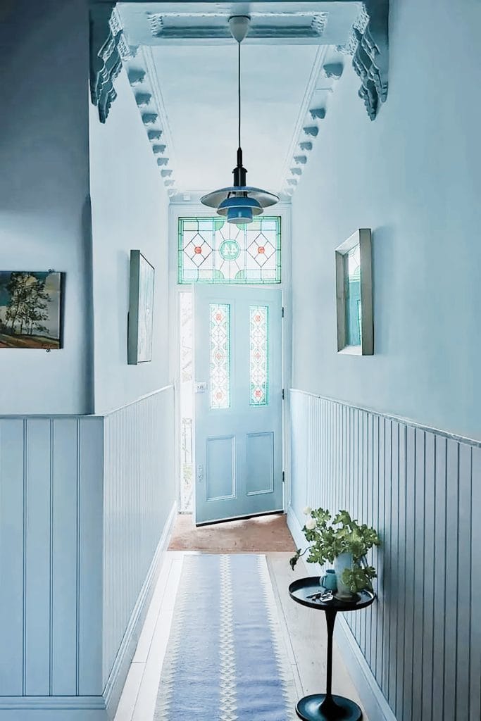
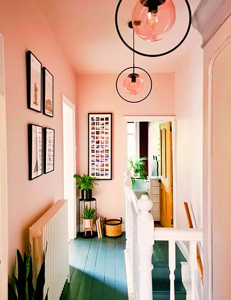
This design approach works especially well in awkward spaces like narrow hallways, stairwells, or rooms with low ceilings. With fewer visual breaks and more visual flow this gives the illusion of extra space. Design math at its finest!
Color Drench with Dark Shades: Cozy Never Looked So Good
Color drenching with darker tones creates an instant cocoon effect—rich, moody, and wildly inviting. These are the rooms that make you want to sit down, settle in, and cancel your plans.
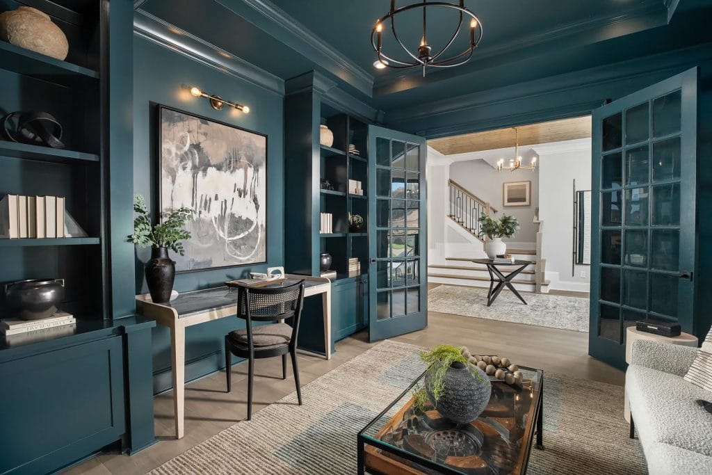
Dark color drenching works beautifully in spaces like living rooms, dining rooms, and bedrooms—anywhere atmosphere really matters. For an extra dose of drama, an ultra-matt finish is a great choice. Its low sheen absorbs light, helping deep colors feel richer, softer, and effortlessly luxe.
Bold, cozy, and totally intentional—this is color drenching at its best.
Don’t be fooled—dark colors don’t automatically make a room feel smaller. In fact, color drenching reduces contrast and visual breaks, allowing the eye to move easily around the space. In many cases, especially in smaller rooms, it can actually create a more expansive, seamless feel.
Color Drenching Highlights Architectural Details
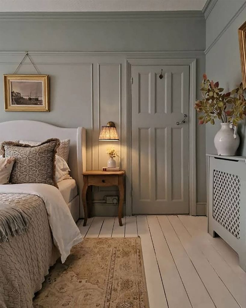
One of the most surprising benefits of this color application is how it enhances architectural features. When trim, molding, paneling, and archways are painted the same color as the walls, they stand out through:
- Shadow
- Texture
- Shape
Instead of competing with contrast, the details feel intentional and elevated.
Choosing the Right Color for Color Drenching
Don’t be misled- this painting technique works with more than just dark or dramatic hues. Lighter tones can create a unique effect as well.
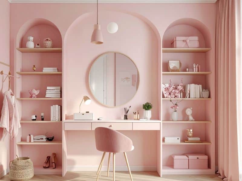
Best Colors for Color Drenching
- Soft pinks & neutrals for an airy, seamless look
- Muted greens and blues for calm, enveloping spaces
- Deep, saturated colors for cozy, dramatic rooms
The key isn’t how bold the color is—it’s how consistently it’s applied.
Is Color Drenching A Trend Or A Historical Nod?
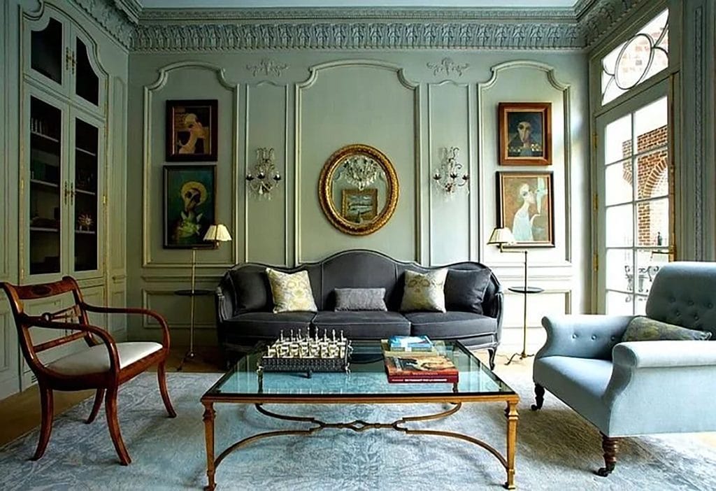
While color drenching has surged in popularity, it’s far from a passing trend. In the 17th and 18th centuries, it was fully in vogue: Baroque and Rococo rooms were designed as total environments, with walls, ceilings, paneling, and furnishings wrapped in the same color family (think Versailles-level greens, golds, and blues). The Victorians carried it forward with muted greens, deep reds, and chocolate browns across walls, trim, and ceilings. Partly practical—masking soot and gas light residue—and partly psychological, these moody spaces were meant to feel cozy, serious, and deeply immersive.
Design techniques that create cohesion, depth, and emotional impact tend to stick around—and color drenching delivers all three.
Final Thoughts on Color Drenching
Color drenching is about commitment. When done well, it transforms a room into a fully realized experience rather than a collection of separate elements.
If you’re looking to create a space that feels bold, cohesive, and undeniably intentional, color drenching may be the design move your home has been waiting for. (Ready to bring your color dreams to life? Reach Natalie here!)