2026 Color of the Year Clash
2026 Color Clash: Two Shades, Two Stories—and Why My Real Vote Goes Somewhere Else Entirely
This post contains affiliate links. If you make a purchase using one of the links - I may receive a small commission, at no extra charge to you. This helps offset content creation for this website.
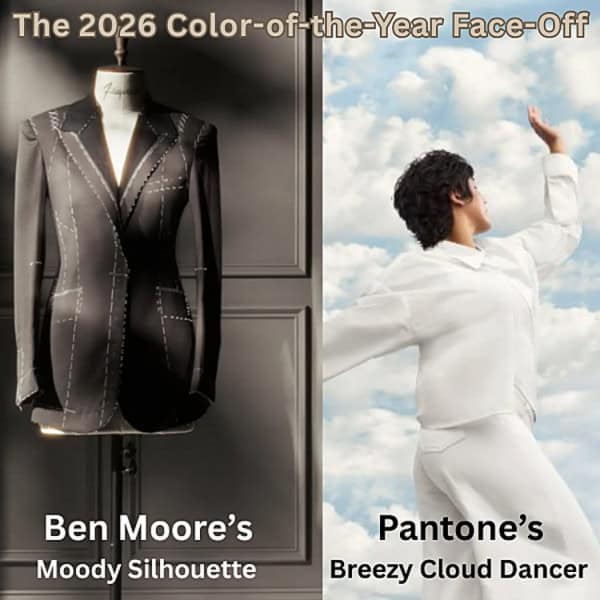
This season, the color authorities didn’t just disagree—they served up dueling philosophies. Benjamin Moore marched in with Silhouette AF-655, a shadowy espresso-charcoal hybrid that practically smooths its own tux jacket. It’s billed as a “rich espresso hue with subtle charcoal undertones,” but the real translation is: 2026 wants to look tailored, structured, and a little bit mysterious. After combing through trade shows, fashion runways, museum galleries, and even car design, forecasters landed on one shared theme: we’re craving quiet structure. Silhouette answers that call with timeless craftsmanship and classic, suit-inspired polish—more “handsome lounge chair” than “default neutral.”

Across the aisle, Pantone chose a very different hill to die on. Enter Cloud Dancer, a whisper-soft white that’s less of a “bold statement” and more “I’m simplifying my life and maybe deleting social media.” It’s not a pure white—it has the faintest wash of warmth, the kind of tone that designers love calling “a blank slate.” Pantone says it represents renewal and clarity. The internet, of course, had other ideas. TikTok users declared it “the color of giving up,” while commenters on X paired it with white flag emojis for dramatic effect. Still, Pantone insists Cloud Dancer symbolizes fresh starts and inner calm—like hitting the reset button on a chaotic year.

The Real Trend Behind Color of the Year: Emotion
And here’s where I drop my actual hot take: Color of the Year is fun—but it’s not the future. Interior design needs less trend forecasting and more emotional forecasting. Clients aren’t craving another annual shade announcement; they’re craving spaces that regulate their nervous systems, spark curiosity & fun, or reconnect them to materials that feel grounding and human. The next frontier of design isn’t a specific palette—it’s a pulse.
Because the real evolution of interiors isn’t visual—it’s biological. We’ve mastered the “how it looks” part. Now we’re moving into the “how it feels” era: designing for dopamine, calm, creative charge, and the actual emotional chemistry of home. And THIS is what I pride myself on as an Interior Designer! I love helping YOU find your COLOR STORY – the right emotional colors for Your Life!

Cloud Dancer to life! Consider soothing accents for calm & clarity.

Pair Silhouette with vibrant tones to spark fun & creativity!
Looking Ahead- A 2026 Color Conversation
So yes, Silhouette brings the moody sophistication and Cloud Dancer brings the gentle reset—but the bigger question isn’t which hue wins 2026.
It’s this: Which feeling is moving in with you? Moody espresso or milky calm is just the surface. Underneath it all, next year’s design conversation is about mindset, meaning, and the emotional life of your space.


