Mastering Color & Lighting: Expert Tips for Painting A Room
Understanding Cool & Warm Colors
So you wanna paint a room? When thinking color- the first thing to understand is that every color either has a blue undertone or a yellow undertone. (It reads as “a cool color” or “warm color” respectively). Why is this important? Because this should be the jumping off point for everything you select within a room if you want to create a harmonious space when painting.
Warm colors (typically reds, oranges, and yellows) often evoke a sense of warmth, and tend to be more energetic and dynamic. Cool colors (which can include shades like blue, green, and purple) often create a calming or soothing effect and are associated with things like water or the sky. BUT – as crazy as it sounds – there can be warm blues & cool reds! This does take a trained eye – but there are a few ways to “test” a color.
The White Paper Test: Quickly Determine If Your Colors Are Warm or Cool
A quick way to determine if your colors are warm or cool is the “White Paper Test”. Hold the color (whether it’s a paint swatch or fabric) next to a pure white sheet of paper. Generally speaking, if the color seems to have a yellower (or creamy) undertone, it’s warm. If it leans toward blue – or feels a bit icy – it’s cool. Some patterned fabric contain both warm and cool colors – which ultimately gives you more flexibility in your new paint selection if that fabric is something you want to coordinate.
If you have trouble distinguishing between warm & cool colors, consider reaching out to a Color Guru for initial guidance.
Quick Guide to Choosing the Right Light Bulbs
But first things first: Check your lighting!! If you’re going to change an overhead fixture or buy a new lamp it is imperative that you do this first! At the very least–determine what kind of light bulbs you are comfortable with BERFORE you start painting. (Options usually include: Warm or Soft White, Cool White & Daylight). Paint colors will appear different depending on the type of light bulb you use. Under warm lighting (like yellow incandescent bulbs), even a cool color might seem warmer. Conversely, under cool lighting (like cool white bulbs or standard LED), warm colors can look cooler.

Lighting Levels Measured in Kelvin (K): Understanding Color Temperature
Kelvin (K) is a unit of measurement for temperature, often used to describe the color temperature of light. It measures the warmth or coolness of a light source.
SOFT (WARM) WHITE = 2700K – 3000K. A warm, yellowish glow often used in cozy spaces such as living rooms, bedrooms & seating nooks.
COOL WHITE = 3500K – 4100K. Neutral crisp, white light ideal for kitchens, offices, bathrooms and workspaces.
DAYLIGHT = 5000K – 6500K. Bright, bluish-white light found in basements, garages and specific task lighting.


Understanding Light Sensitivity
TRUTH BE TOLD everyone has their own sensitivity to light. Some people don’t mind & don’t think twice about their lighting! Other people are highly sensitive – turning lights off & on to create the “right level of light” throughout the day & night. Highly sensitive people often prefer warmer light bulbs, varying levels of light & the ability to dim light fixtures. Find out who the room is serving and what their sensitivities are before you paint and before you change the light sources.

PRO TIP: Always assess colors under natural or neutral light (never at a paint store!) for a true temperature reading. When selecting the lighting for your space, be sure all bulbs are the same.
How to Choose the Perfect Color Palette for Your New Room or Remodel
After you’ve selected your light bulbs & discovered the warm or cool tones in your existing décor you can move forward. It’s time to select a new color palette with your warm or cool base! Now is the perfect time to explore colors & branch out. A color palette is 3-6 colors so it is helpful to come up with a triad of colors at the very least to play with.
If your space is a total remodel or a stand-alone room revamp (such as a bedroom), you really can lean the color palette in any direction you please. You still need to be mindful of trim, baseboards, & flooring however- but for the most part you will have a clean slate to start painting in. (Unless your carpet or flooring reads grey or really creamy- if that’s the case, reach out to me now for a quick consult! )
If you view this as a “fresh start”- have fun & explore the vibe that you’re going for in this space. The right color can make a room feel cozy, vibrant, calm, or energized—all depending on the mood you want to create & the function of the space.

Selecting the Best Colors for Your Room Based on Function and Furniture
After you determine the vibe & the function of the space, next you need to determine what furniture will be landing in this space. Do you have an existing sofa or chair? Are you willing to recover this to blend with a new color scheme? Are you purchasing new furniture? Consider honing in on a piece or two to coordinate & make good color decisions.
PRO TIP: It is often more expensive to purchase new fabric & pay for the reupholstery than to paint a room!
Once the function & vibe of the room is determined and you’re aware of a few pieces of furniture that will be going in the space – its time to make some color decisions! Do you love crisp, clear colors? Do you lean towards earth-tones? Do you have a favorite color? Are you trying to neutralize the space? What ever direction you decide to go – remember that a “color palette” is made up of 3-6 colors. (This holds true even with a neutral décor, FYI!) Need help creating the PERFECT PALETTE for your room? Clink here for a Color Consultation.
Using Inspiration Pieces to Select the Perfect Colors for Your Room
Another method that is helpful in selecting colors for a room is discovering an inspiration piece. This could be a new comforter, an interesting vase, vintage pillow, or a photograph of your favorite vacation spot. Any of these items could help lead you to a new color scheme for this remodeling project.

“I’m Just Painting A Room” – Reality Check!
If you don’t plan to gut a room and start over and you just want to paint the walls a new color (famous last words!) there are still many things to consider. It’s time to GET REAL! If you plan to paint any room, something else will inevitably change- even if you’re not planning on doing an overhaul. Ultimately there will be new sheers, rug, chair, comforter, recliner, or other décor items that will be purchased. So, budget accordingly for some additional updates.
If you’re truly trying to freshen up the walls & you want to keep your existing décor (or existing flooring etc. in a kitchen refresh project) you must attempt to blend the old with the new. Determining if your existing color & décor choices lean “warm” or “cool” is imperative!
FUN FACT: Even neutrals paint colors- including every shade of white – has a warm or cool undertone! SHADES OF TAUPE are really the only chameleon colors that can play nicely with both sides.
Creative Ways to Use Color: Ceilings, Walls, and Furniture in Your Room Design
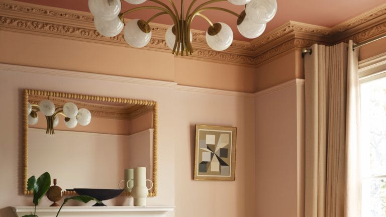
Try thinking outside the box; consider painting the ceiling a color & the walls neutral. Or perhaps painting 2 walls a deep tone and the other two a softer shade. Or create a focal point by painting one main wall (typically the first wall you see straight ahead) a deep color. Another way to introduce a new color palette is to paint furniture or accessories in the room. Painting a wooden chair, dresser, bookshelves or even a picture frame goes a long way to incorporate your new color scheme. Paint is the cheapest way to change & upgrade a space….why not make it work for you?

Accurately Testing Paint Colors: Tips for Choosing the Right Shade for Your Room
Unless you’re dealing with white walls to start with, you’re likely looking at new paint swatches or paint marks on existing painted walls. This can be a disaster because the new potential color will be visually tainted by the existing color of the room! If possible, get a large piece of foam board & cut in half. Paint both halves with your sample paint. After the paint has dried find a corner in your room to butt up these samples together. This new color (on two right angled walls) should bounce off each other – giving you a “true read” of the paint tone, allowing you to accurately evaluate the color.
After reading these guidelines hopefully you feel a bit more empowered to select the right color palette for your room… and the right light bulbs as well! If you’re still confused about your colors or the process – consider a Paint Consultation to steer you in the right direction! Need more extensive guidance & planning with color palettes & design ideas? Contact me here.